
An accessible document reader application

What is Personalize? 🧑🏻💻
An inclusive and accessible application designed to empower readers in tailoring their digital reading experience. The application offers an array of features including natural tone screen reading, precise text magnification, obscuring irrelevant content, customizable font and color settings, and adaptable text background colors. This application strives to grant readers greater control over their digital reading experience, ensuring it's both accessible and personalized to their requirements.
Team
Me (Design + Research)
Jisu Park (PM)
Patricia Ho (Design + Research)
Yilei Dai (Design + Research)
JA (Co-design participant)
My Role
Research Analysis, Brainstorming, Moderating Co-Design, Mid-fidelity Prototyping
Timeline
Jan 2023 - Mar 2023
Context of the Project 📃
This project was part of the HCDE 515 - Accessibility and Inclusive Design class with one co-design participant who suffered from visual impairment. Every visual impairment is different and Personalize was created with the aim to assist our participant and issues faced by her in her learning experience. However, we believe that the solution is customizable and can help a broader range of visual impairments.

Problems 🧐
Our participant has amblyopia, often known as lazy eye, and aphantasia, the inability to visualize. These visual impairments affect different aspects of her life.
She has previously tried using assistive technologies like screen readers but found them to be impractical. Many of these solutions primarily cater to the prevalent visual impairments and lack the flexibility for users to personalize settings according to their comfort and needs.
Goals 🚩
The main objective of this co-design session is to tackle the challenges our participant encounters during their digital reading and learning experience. Our goal is to develop a solution that can be personalized to cater to their specific needs while being inclusive and user-friendly.
Our Solution 🥁

High-fidelity prototype walk-through
The process we followed...
Firstly, Research 🔬
How did we do it?
-
Semi-structured interview with participant
-
Competitor Analysis
What we found?
01
Trouble recognizing color and inability to visualize 3D objects clearly.
02
High-contrasts give seizures.
E.g. black text on white background.
03
The presence of numerous graphics, motion, images, or videos combined with text causes discomfort and hinders her ability to read.
Competitive analysis findings

Dalton Chrome extension that modifies colors in images for people with color blindness.

Helperbird Chrome extension that highlights texts line by line to help with reading.

Microsoft OneNote that provides an accessible note-taking/reading experience with features like changing font-style, font color, and font-size.
But why 'Personalize'? 🤔
A comprehensive reading accessibility tool that could address a spectrum of visual disability requirements, or one that could be personalized to accommodate diverse disability needs, was lacking.
Ideation through Co-design 💡
Modified Crazy 8's
Our team and the participant engaged in the Modified Crazy 8's activity, where we had 20 minutes to sketch out as many ideas as possible.
We made modifications to the original Crazy 8's by allowing participants to create as many sketches as they could within the time frame. This change was necessary to accommodate the participant who has Aphantasia and may have found the original method uncomfortable or pressuring.


Crazy 8's
Affinity Mapping
Following the Crazy 8's activity, we conducted a speed critique session to discuss the ideas, and our participant provided feedback on her preferences. Based on this feedback, I facilitated the affinity mapping of ideas.

Affinity Mapping and Speed Critique
Co-design insights
01
Accessible desktop application over web application/plugin because our participant preferred to download and read her materials.
02
A keyboard shortcut for all features to enhance and simplify her reading experience.
03
A toolbar with accessibility functions.
Design through Iterations ✏️
Based on our insights from the co-design, we narrowed down the features for the desktop application.
We mocked-up a low-fidelity version to communicate our finalized ideas and we did an internal critique session. Based on the feedback from team, we created a high-fidelity prototype to test with our participant.


Low-fidelity mock-ups
Onboarding process
The onboarding process aims to provide new users with personalized accessible feature recommendations based on their individual needs. Additionally, they have the option to create a profile for saving their customizations and settings. Users may also opt to bypass the onboarding and adjust their personalizations in the application's settings at a later point.

01
02
03
04
Onboarding screens
Screen reader
This feature offers a natural tone reading experience, allowing her to relax and listen to the document. She can highlight specific portions and have them read aloud, or she can opt to have the entire document read with the currently spoken section highlighted. Controls, including play/pause, are conveniently located next to the section being read for easy management. Additionally, she can adjust the reading speed to her preference.

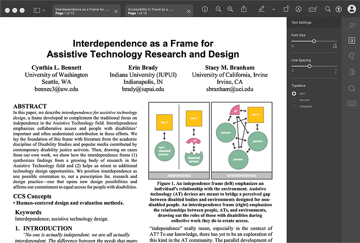
Text settings
She can adjust text size, character spacing, and typeface to tailor their reading experience.
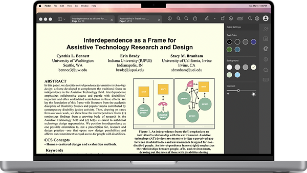
Color settings
Tying back to her sensitivity to high-contrast, we decided to incorporate a feature that enables her to customize the background color of the document, the text color, and the contrast.

Blurring features
To assist our participant in maintaining focus on the primary reading content, we introduced a feature that permits her to selectively blur unnecessary images, videos, moving graphics, and other distractions.

Magnify
While many existing products enable users to magnify and read, there is a lack of solutions that allow users to magnify specific portions of the content. In response, we introduced a feature that allows our participant to zoom in on a particular portion and then easily navigate forward or backward within that magnified area.


JA's remarks after usability testing❗
👍🏻
"I love this. I wish this tool existed in real life."
Finally, the Prototype 🥁
Lastly, Reflections and Learnings ✍🏼
01
This was my first experience participating in this co-design activity. It served as a valuable learning opportunity, teaching me how to adjust to our participant's requirements in a co-design setting and how to effectively lead such sessions.
02
This experience has been a lesson in the importance of recognizing and challenging my preconceived notions and biases when designing products with a focus on accessibility. It reinforces the importance of integrating accessibility and inclusivity as integral elements of the design process from the outset, rather than treating them as an afterthought.
03
This experience highlighted the diversity of disabilities, emphasizing that a solution tailored to one specific impairment may not necessarily address the needs of other users with the same impairment, given the potential for significant variations in their requirements.