
BirdWeb Website Redesign (Mobile)

What is BirdWeb? 🐥
Seattle Audubon Society's BirdWeb website enables users to learn about birds, locate birding locations and ecoregion, learn about bird species of particular conservation concern, find birding resources, and connect with Seattle Audubon's main website and other environmental conservation initiatives.
Team
Me (UX Designer & Front-end Engineer)
Mina Ryu
Lo Ciaflone
Lily Yang
My Role
UX Research, UX Design, UX Testing, Interaction Design
Time
Jun 2022 - Aug 2022
Problems 🧐
Users of BirdWeb expressed dissatisfaction with the website's outdated design and its lack of responsiveness on mobile devices. Additionally, our clients have raised concerns about the infrequent usage of the website, and and noted that the website did not align with Seattle Audubon's brand identity.

* Actual screenshot of the current website when viewed on mobile.
Outcomes & Results ✨
60%
Improved accessibility to bird and bird-watching sites’ information
80%
Reduction in information load
Our Solution 🥁

Overview of our Process 👓

Research
-
Previous Survey Data (N=212)
-
Comparative Analysis
-
Heuristic Evaluation
-
Accessibility Audit
-
User Persona

Ideate
-
Define scope of work
-
Paper sketches
-
Feature prioritization
_edited.png)
Design
-
Mid-fidelity Prototype
-
Document design decisions
-
Design System and Components

Test & Redesign
-
User testing (N=5)
-
Affinity Diagramming
-
Research Report
-
Technical Feasibility
-
Prototype Hi-Fidelity
Firstly, Research 🔬
Problems

01 Outdated design
02 Less frequently used
03 Not responsive on mobile phones
04 Inconsistent with Seattle Audobon Society brand
* Actual screenshot of the current website when viewed on mobile.
Persona

Ideation 💡
Scope of Redesign
01 Home Page
02 Browse Ecoregions (Bird watching sites) Page
03 Ecoregion Info Page
04 Bird Info Page
Paper Sketches
The team spent a week brainstorming different ideas for pages and made final sketches by combining our most favorite ideas.
01
Home Page

02
Ecoregions Page

03
Ecoregion Info Page

04
Bird Info Page

Design Iteration #1 ✏️
Mid-Fidelity Prototype
01
Birds list on ecoregion info page
Issues

Long unordered lists of birds
Non-sticky column headers
Information Overload
Users need to remember codes
Solution

Filter option
Bird pictures for better identification
02
Audio player and clear CTA's
Issues
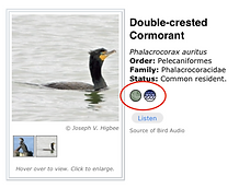
Button description only on hover state (not visible on mobile)
No user control while playing sound
Solution

Added clear CTA's
Sound player to STOP/PAUSE bird sound
03
Compare birds and Recently viewed birds feature
Issues
User needs to go back and forth to compare different birds of similar species.
User has to search or navigate to the previous page if they want to go back to previously viewed birds.
Solution

Compare feature for different birds of same family
Recently viewed birds to easily navigate between viewed birds
Design System 🎨


Test 📋
Participants
02 Experienced Birdwatchers
03 Novice Birdwatchers
Tasks
01
Find bird information

02
Find Ecoregion information

03
Navigate to other conservation projects and main website

Results
What worked well


Key usability issues

01 Low scanability of content
02 Small text size
03 Use of jargon
04 Confusing buttons
05 Lack of interactivity in maps
Design Iteration #2 ✏️
After finalizing the features, we collaborated with the site developer to understand the technical feasibility of our proposed solutions.
Based on the feedback from users and the technical dev team, we created our final high-fidelity prototypes.
01
Small text size
Issue

Difficult to read small text
Solution

Single column design to accommodate larger text and images
Subheadings - 16pt
Descriptions - 14pt
02
Information Overload
Issue

New users:
Overwhelmed by information
Experienced users:
Low scanability of information
No shortcuts
Solution

Changed to clean and minimal layout with "read More" button
Separated information by categories
03
Jargon
Issue

New users:
Birding terms such as ecoregions

All users:
Unknown project CTA's such as Sound to Sage
Note about CTA was not read by most users.
Solution

Changed birding specific language to more beginner friendly
Changed names of CTA's to more descriptive names (Sound to Sage -> Nesting data)
04
Maps don't look interactivity
Issue

Maps didn't look clickable even when they were
Users wanted to interact with the map
Solution

Added location feature to help users locate themselves on the map
Added visual and descriptive cues to help users interact
Final Design 🥁
Reflection ✍🏼
Learnings & Takeaways
This was the first time I worked in a team and for a client. I learned that working in a team can help you come up with better solutions, get critique on your designs, and see the biases you get into the design.
Working with a client was a great learning experience because we had to work on creating a balance between the business needs and the user needs by involving multiple stakeholders. We also had to understand the technical feasibility of our design for which we had to work closely with the site developer.
Next Steps
The immediate next steps would be to conduct a round of usability testing to ensure our redesign did not introduce any new issues and that the changes are effective.